getting started
There are 4 ways to get started with Spectre CSS framework in your projects. You can either manually install or use NPM and Bower.
Install manually
Download the compiled and minified Spectre CSS file (about 27KB):
Install with NPM
On a terminal window:
npm install spectre.css
Install with Bower
On a terminal window:
bower install spectre.css
You need to add the file to your project resources.
And include it in Hoplon page (head)
(link:href"dist/spectre.min.css":rel"stylesheet":type"text/css")Use from a CDN
Include it in your Hoplon file (head)
(link:href"https://cdnjs.cloudflare.com/ajax/libs/spectre.css/0.1.32/spectre.min.css":rel"stylesheet":type"text/css")compiling custom version
Spectre uses Gulp for compiling CSS. You can customize your version of Spectre.css by editing LESS files in /src directory or removing unneeded components from spectre.less.
Then, you can build the CSS file from the command line:
- Navigate to the root directory of Spectre where you can find
package.jsonfile. - Run
npm install. NPM will install all dev dependencies as listed in package.json. - When completed, run
gulp buildto compile LESS to CSS and minify files. - You can find compiled CSS files in
/distdirectory.
You can watch file changes and rebuild CSS files by using gulp watch.
typography
Typography sets default styles for headings, paragraphs, semantic text, blockquote, lists and code elements.
headings
H1 Title 5rem
H2 Title 4rem
H3 Title 3rem
H4 Title 2.4rem
H5 Title 2rem
H6 Title 1.6rem
(h1"H1 Title "(s/label"5rem"))
(h2"H2 Title "(s/label"4rem"))
(h3"H3 Title "(s/label"3rem"))
(h4"H4 Title "(s/label"2.4rem"))
(h5"H5 Title "(s/label"2rem"))
(h6"H6 Title "(s/label"1.6rem"))
paragraphs
Lorem ipsum dolor sit amet, consectetur adipiscing elit. Praesent risus leo, dictum in vehicula sit amet, feugiat tempus tellus. Duis quis sodales risus. Etiam euismod ornare consequat.
Climb leg rub face on everything give attitude nap all day for under the bed. Chase mice attack feet but rub face on everything hopped up on goofballs.
(p"Lorem ipsum dolor sit amet, consectetur adipiscing elit. Praesent risus leo, "(a:href"#typography""dictum in vehicula sit amet")", feugiat tempus tellus. Duis quis sodales risus. Etiam euismod ornare consequat.")
(p"Climb leg rub face on everything give attitude nap all day for under the bed. Chase mice attack feet but rub face on everything hopped up on goofballs.")
semantic text elements
(abbr)(strong)(b)(cite)Hello World!(code)(del)(em)(i)(ins)(kbd)(mark)(ruby)(s)(samp)(sub)(sup)(time)(u)(var)optimized for asian fonts
好, こんにちは, 안녕하세요
Chinese (Simplified)
革命不是请客吃饭,不是做文章,不是绘画绣花,不能那样雅致,那样从容不迫,“文质彬彬”,那样“温良恭俭让”。革命就是暴动,是一个阶级推翻一个阶级的暴烈的行动。
Chinese (Traditional)
山不在高,有仙則名;水不在深,有龍則靈。斯是陋室,惟吾德馨。苔痕上階綠,草色入簾青;談笑有鴻儒,往來無白丁。可以調素琴,閱金經。無絲竹之亂耳,無案牘之勞形。南陽諸葛廬,西蜀子雲亭。孔子云:「何陋之有?」
Japanese
祇園精舎の鐘の声、諸行無常の響きあり。沙羅双樹の花の色、盛者必衰の理をあらはす。おごれる人も久しからず。ただ春の夜の夢のごとし。たけき者も遂にはほろびぬ、ひとへに風の前の塵に同じ。
Korean
나라말이 중국과 달라, 한문・한자와 서로 통하지 아니하므로, 어리석은 백성들이 말하고자 하는 바가 있어도, 끝내 제 뜻을 펴지 못하는 사람이 많다. 내가 이를 불쌍히 여겨, 새로 스물 여덟 글자를 만드니, 사람마다 하여금 쉽게 익혀, 날마다 씀에 편하게 하고자 할 따름이다.
blockquote
Lorem ipsum dolor sit amet, consectetur adipiscing elit. Integer posuere erat a ante.
- Source
(blockquote(p"Lorem ipsum dolor sit amet, consectetur adipiscing elit. Integer posuere erat a ante.")(cite"- Source"))lists
- list item 1
- list item 2
- list item 2.1
- list item 2.2
- list item 2.3
- list item 3
- list item 1
- list item 2
- list item 2.1
- list item 2.2
- list item 2.3
- list item 3
- description list term 1
- description list description 1
- description list term 2
- description list description 2
- description list term 3
- description list description 3
(s/ul(li"list item 1")(li"list item 2"(ul(li"list item 2.1")(li"list item 2.2")(li"list item 2.3")))(li"list item 3"))

(s/ol(li"list item 1")(li"list item 2"(ol(li"list item 2.1")(li"list item 2.2")(li"list item 2.3")))(li"list item 3"))

(s/dl(dt"description list term 1")(dd"description list description 1")(dt"description list term 2")(dd"description list description 2")(dt"description list term 3")(dd"description list description 3"))
tables
Tables include default styles for tables and data sets.
| name | duration | genre | release date |
|---|---|---|---|
| The Shawshank Redemption | 2h 22min | Crime, Drama | 14 October 1994 USA |
| The Godfather | 2h 55min | Crime, Drama | 24 March 1972 USA |
| Schindler's List | 3h 15min | Biography, Drama, History | 4 February 1994 USA |
| Se7en | 2h 7min | Crime, Drama, Mystery | 24 March 1972 USA |
Use the element (s/table) to add padding, border and emphasized table header. Use :options #{:striped} to (s/table) to add zebra striped style. For hoverable table rows, you can add :options #{:hover} to enable hover style.
Use the class selected to make (tr) element highlighted.
(s/table:options #{:striped:hover}(thead(tr(th"name")(th"duration")(th"genre")(th"release date")))(tbody(tr(td"The Shawshank Redemption")(td"2h 22min")(td"Crime, Drama")(td"14 October 1994 "(s/label"USA")))(tr(td"The Godfather")(td"2h 55min")(td"Crime, Drama")(td"24 March 1972 "(s/label"USA")))(tr(td"Schindler's List")(td"3h 15min")(td"Biography, Drama, History")(td"4 February 1994 "(s/label"USA")))(tr(td"Se7en")(td"2h 7min")(td"Crime, Drama, Mystery")(td"24 March 1972 "(s/label"USA")))))forms
Forms provide the most common control styles used in forms, including label, input, textarea, select, checkbox, radio and switch.
(form:action"#forms"; form input control(s/form-group(s/form-label:for"input-example-1""Name")(s/input:type"text":id"input-example-1":placeholder"Name")); form radio control(s/form-group(s/form-label"Gender")(s/input-radio:name"gender""Male")(s/input-radio:name"gender""Female")); form select control(s/form-group(s/select(option"Choose an option")(option"Slack")(option"Skype")(option"Hipchat"))); form switch control(s/form-group(s/input-switch"Send me emails with news and tips")); form textarea control(s/form-group(s/form-label:for"input-example-3""Message")(s/textarea:id"input-example-3":placeholder"Textarea":rows"3")); form checkbox control(s/form-group(s/input-checkbox"Remember me")))If you want to have a horizontal form, add the class form-horizontal to the (form) function. And add the class col-[xs|sm|md|lg|xl]-[1-12] to the child elements for form row layout.
(form:class"form-horizontal"(s/form-group(div:col3(s/form-label"Name"))(s/input:col9:type"text":placeholder"Name"));; Form structure
)To use form validation styles, add :options #{:success} and :options #{:error} to the inputs or their (s/form-group). You can use the element (s/input-hint) to provide form validation success and error messages.
The name is invalid
The email is available
The option is invalid
The option is valid
(form;; on form-group(s/form-group:options #{:success}(s/form-label"Name")(s/input:type"text":placeholder"Name")(s/input-hint"The name is valid"));; on input(s/form-group(s/form-label"Email")(s/input:options #{:success}:type"text":placeholder"Email")(s/input-hint"The email is available")))For smaller or larger input and select controls, you could add :options #{:sm} or :options #{:lg} to the elements.
input groups
If you want to attach text and button along with an input, use the element (s/input-group). And use the element (s/input-group-text) for text and add :options #{:input-group} to the button element. Buttons, inputs and text can be made large or small using :options #{:lg} or :options #{:sm}.
;; normal input group
(s/input-group(s/input-group-text"slack.com/")(s/input:type"text":placeholder"site name"))

;; large input group
(s/input-group(s/input:options #{:lg}:type"text":placeholder"username")(s/input-group-text:options #{:lg}"@slack.com"))

;; normal input group with button
(s/input-group(s/input-group-text"slack.com/")(s/input:type"text":placeholder"site name")(s/button-primary:options #{:input-group}"Submit"))
labels
Labels are formatted text tags for highlighted, informative information.
Use the element (s/label). You can use the elements (s/label-primary), (s/label-success) and (s/label-danger) for a colored label.
(s/label"default label")
(s/label-primary"primary label")
(s/label-success"success label")
(s/label-danger"danger label")
media
Media include responsive image, figures and video classes.
Use the element (s/img). The images will scale with the parent sizes.
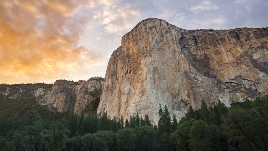
You can use the element (s/figure) for an image with a caption. The images created with the (s/img) element will be reponsive. Use the (s/figcaption) for caption. Also you can use :options #{:left}, :options #{:center} and :options #{:right}for caption aligment.
For responsive video, add a container with the class video-responsive. Insert any YouTube, Youku or other iframe/embed video inside the container. The ratio is 16:9 by default. You may add video-responsive-4-3 for 4:3 ratio video container orvideo-responsive-1-1 for 1:1 ratio.
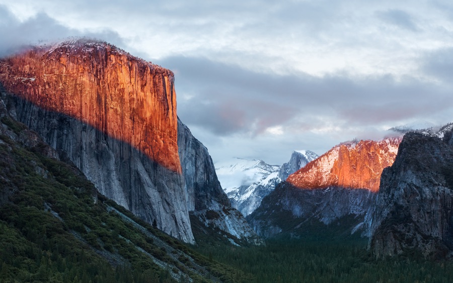
(s/img:options #{:rounded}:src"images/osx-el-capitan.jpg")

(s/figure(s/img:options #{:rounded}:src"images/osx-yosemite-2.jpg")(s/figcaption:options #{:center}"macOS Yosemite wallpaper"))

(div:class"video-responsive"(iframe:frameborder"0",
    :src"https://www.youtube.com/embed/BzMLA8YIgG0",
    :width"560",
    :height"315",
:allowfullscreen""))flexbox grid
Layout includes flexbox based responsive grid system with 12 columns.
Use the element (s/columns) inside a container with the class container. And add any element you want with the attribute :column inside the container. These columns will take up the space equally. You can specific the width of each column by adding the number of columns :column [1-12].
And you can add :options #{:gapless} to have gapless columns.
By default, Spectre grid has multi-line flexbox enabled. You can add the option :options #{:online} to (s/columns) to make all its child columns positioned in the same single row.
(div:class"container"(s/columns(div:column6":column 6")(div:column3":column 3")(div:column2":column 2")(div:column1":column 1"))(s/columns:options #{:gapless}(div:column6":column 6")(div:column6":column 6"))(s/columns:options #{:oneline}(div:column8":column 8")(div:column8":column 8")))responsive grid
Hoplon Spectre provides a neat responsive layout grid system. There are :column-xs [1-12], :column-sm [1-12] and :column-md [1-12] available for flexible grid across mobile, tablet and desktop viewport usage.
- For window width less than 480px, all columns will show as a single row.
:column-xs [1-12]apply to window width greater than or equal to 480px.:column-sm [1-12]apply to window width greater than or equal to 600px.:column-md [1-12]apply to window width greater than or equal to 840px.:column-lg [1-12]apply to window width greater than or equal to 960px.:column-xl [1-12]apply to window width greater than or equal to 1280px.
(div:class"container"(s/columns(div:column-xs6":column-xs 6")(div:column-xs3":column-xs 3")(div:column-xs3":column-xs 3")))For hiding elements on specific viewport sizes, there are the hide attribute :hide #{:xs}, :hide #{:sm}, :hide #{:md}, :hide #{:lg} and :hide #{:xl} available.
:hide #{:xs}hides elements when the viewport is smaller than or equal to 480px.:hide #{:sm}hides elements when the viewport is smaller than or equal to 600px.:hide #{:md}hides elements when the viewport is smaller than or equal to 840px.:hide #{:lg}hides elements when the viewport is smaller than or equal to 960px.:hide #{:xl}hides elements when the viewport is smaller than or equal to 1280px.
empty states/blank slates
Empty states/blank slates are commonly used as placeholders for first time use, empty data and error screens.
You have no new messages
You are not following anyone
An empty state component can include icons, messages(title and meta messages) and action buttons or any combination of those elements. Add empty-title, empty-meta or empty-action to the elements. HTML structure is exampled below.
(section:class"empty"(i:class"icon icon-markunread")(p:class"empty-title""You have no new messages")(p:class"empty-meta""Click the button to start a conversation.")(s/button-primary:class"empty-action""Send a message"))avatars
Avatars are user profile pictures.
Use the element (s/avatar) or (s/avatar-img). There are 4 additional sizes available, including :options #{:xl} (64px), :options #{:lg} (48px), :options #{:sm} (24px), and :options #{:xs} (16px). By default, the avatar size is 32px.
For users who don't have profile pictures, you may use their initials for avatars. Use the element (s/avatar) with the attribute :data-initial "XY" where XY is the name that will appear inside the avatar.
(s/avatar:options #{:xl}(img:src"images/avatar-1.png"))

(s/avatar:options #{:xl}(img:src"images/avatar-1.png")(s/avatar-icon:src"images/avatar-5.png"))

(s/avatar:options #{:xl}:data-initial"YZ":css{:background-color"#5764c6"})

; Shows initals when avatar image is unavailable or not fully loaded
(s/avatar:options #{:xl}:data-initial"YZ":css{:background-color"#5764c6"}(img:src"images/avatar-1.png"))
chips
Chips are complex entities in small blocks.
Thor OdinsonSteve RogersAdd a container element (s/chip). And add child text elements with (s/chip-text) or icons with (s/icon).
(s/chip(s/chip-text"Crime")(s/button-clear))

(s/chip(s/icon"icon-favorite_border")(s/chip-text"Drama")(s/button-clear))

(s/chip(s/avatar-img:src"images/avatar-1.png")(s/chip-text"Yan Zhu")(s/button-clear))
autocomplete
Autocomplete form component provides suggestions while you type. It is often used for tags and contacts input.
Thor OdinsonSteve RogersAdd a container element (s/autocomplete). There are 2 parts of it, one is (s/autocomplete-input), another is (s/autocomplete-list). Spectre.css does not include JavaScript code, you will need to implement your JS to interact with the autocomplete.
The autocomplete HTML structure is exampled below.
(s/autocomplete; autocomplete input container(s/autocomplete-input; autocomplete chips(s/avatar-chip-input"Tony Stark""images/avatar-1.png")(s/avatar-chip-input"Thor Odinson""images/avatar-2.png" #{:selected}); autocomplete real input box(s/input:text"text":placeholder"typing here")); autocomplete suggestion list(s/autocomplete-list; autocomplete list avatar chips(s/autocomplete-item-avatar-chip"Steve Rogers""images/avatar-4.png")(s/autocomplete-item-avatar-placeholder-chip"Tony Stark""#A2A8E1""TS")))tooltips
Tooltips provide context information labels that appear on hover and focus.
Tooltip component is built entirely in CSS.
Use the function (s/add-tooltip tooltip-content position), where position can be one of :right, :bottom or :left to define the position of a tooltip. By default, the tooltip appears above the element.
(s/add-tooltip(s/button-primary"top tooltip")"Lorem ipsum")
(s/add-tooltip(s/button-primary"right tooltip")"Lorem ipsum":right)
badges
Badges are often used as unread number indicators.
Use the attribute :badge content to non self closing elements. content is content of a badge. The badge will appear in the top-right direction of the element.
(span:badge"99""Notifications")toasts
Toasts are used to show alert or information to users.
Use the element (s/toast). You can add any text within the container, and even icons. You may also add a close button using (s/button-clear :class "float-right") if you need.
And you can use the elements (s/toast-primary), (s/toast-success) or (s/toast-error) for additional toast colors.
(s/toast(s/button-clear:class"float-right")"Lorem ipsum dolor sit amet, consectetur adipiscing elit.")

(s/toast-primary(s/button-clear:class"float-right")(s/icon"icon-error_outline" )"Lorem ipsum dolor sit amet, consectetur adipiscing elit.")
menus
A menu is a vertical list of links or buttons for actions and navigation.
- Steve Rogers
Add a container element (s/menu). And add child elements with (s/menu-item) or (s/menu-link). You can separate menu items with a divider or (s/menu-header). Spectre.css does not include JavaScript code, you will need to implement your JS to interact with the menus.
(s/menu(s/menu-header"Go to")(s/menu-link:href"#"(s/icon"icon-link")"Slack")(s/menu-link:href"#"(s/icon"icon-link")"Hipchat")(s/menu-link:href"#"(s/icon"icon-link")"Skype")(li:class"divider"); menu divider(s/menu-link:href"#"(s/icon"icon-link")"Settings"))dropdowns
A dropdown is a combination of buttons and menus.
Dropdown menus component is built entirely in CSS. It is triggered by :focus event.
Add a container element (s/dropdown). And add button or a group-button (s/dropdown-simple-button) or (s/dropdown-group-button) and a (s/menu) right next to it
Also, you can implement your JS to interact with the dropdown menus by adding the class active to the dropdown.
(s/dropdown; basic dropdown button(s/dropdown-simple-button:options #{:link}"dropdown button "(i:class"icon-caret")); menu component(s/menu(s/menu-item"Slack")(s/menu-item"Hipchat")(s/menu-item"Skype")))
(s/dropdown; dropdown button group((s/dropdown-group-button"dropdown button"); menu component(s/menu(s/menu-item"Slack")(s/menu-item"Hipchat")(s/menu-item"Skype"))))modals
Modals are flexible dialog prompts.
This is the content inside the modal.
Lorem ipsum
Lorem ipsum dolor sit amet, consectetur adipiscing elit. Praesent risus leo, dictum in vehicula sit amet, feugiat tempus tellus. Duis quis sodales risus. Etiam euismod ornare consequat.
Climb leg rub face on everything give attitude nap all day for under the bed. Chase mice attack feet but rub face on everything hopped up on goofballs.
Cupcake ipsum
Jelly-o sesame snaps halvah croissant oat cake cookie. Cheesecake bear claw topping. Chupa chups apple pie carrot cake chocolate cake caramels.
De braaaiiiins apocalypsi gorger omero prefrontal cortex undead survivor fornix dictum mauris. Hi brains mindless mortuis limbic cortex soulless creaturas optic nerve.
Candy ipsum
Efficiently unleash cross-media information without cross-media value. Quickly maximize timely deliverables for real-time schemas. Dramatically maintain clicks-and-mortar.
Caerphilly swiss fromage frais. Brie cheese and wine fromage frais chalk and cheese danish fontina smelly cheese who moved my cheese cow.
Add a container element with the class modal. And add a real container modal-container and overlay modal-overlay inside it. You can add child elements with the class name modal-header, modal-content and modal-footer - any or all of them.
Spectre.css does not include JavaScript code, you will need to implement your JS to interact with modals. To make a modal appear, add the class active to the modal container.
; modal-options-cell has the options for the modal. When the option :active is set
; the modal is show.
(defc modal-options-cell #{})

(s/modal:options modal-options-cell
  (s/modal-header(s/button-clear:class"float-right":click #(swap! modal-options-cell disj :active); on click removes the :active option
      )(s/modal-title"Modal title"))(s/modal-body; content goes here
    )(s/modal-footer(s/button-link:click #(swap! modal-options-cell disj :active); on click removes the :active option"Close")(s/button-primary"Share")))

(s/button-primary:click #(swap! modal-options-cell conj :active); on click sets the :active option"Show the modal")
modal sizes
Add the attribute :options #{:sm} for a smaller modal dialog.
(defc modal-sm-options-cell #{:sm})

(s/modal:options modal-sm-options-cell
  ; modal structure here
  )

(s/button-primary:click #(swap! modal-sm-options-cell conj :active)"Show the modal small")
cards
Cards are flexible content containers.
Microsoft
Software and hardware
Apple
Hardware and software

Software and hardware
Apple
Hardware and software
Google I/O
Add a container element (s/card). And add child elements (s/card-image), (s/card-header), (s/card-body) and/or (s/card-footer). The (s/card-image) can be placed in any position.
(s/card(s/card-image:src"images/osx-el-capitan.jpg")(s/card-header(h4:class"card-title""Microsoft")(h6:class"card-meta""Software and hardware"))(s/card-body"Empower every person and every organization on the planet to achieve more.")(s/card-footer(s/a-button-primary:href"#""Do")))Position utilities are used for useful layout and position things, including clearfix, float, position and margin/padding utilities.
; clear float
(div:class"clearfix")
; float: left and right
(div:class"float-left")
(div:class"float-right")
; position: relative, absolute and fixed
(div:class"rel")
(div:class"abs")
(div:class"fixed")
; centered block
(div:class"centered")
; margin: 10px and 5px in 4 directions. mt-10 = margin-top: 10px;
(div:class"mt-10")
(div:class"mt-5")
; padding: 10px and 5px in 4 directions. pt-10 = padding-top: 10px;
(div:class"pt-10")
(div:class"pt-5")
Display utilities are used for display and hidden things.
; display: block;
(div:class"block")
; display: inline;
(div:class"inline")
; display: inline-block;
(div:class"inline-block")
; display: flex;
(div:class"flex")
; display: inline-flex;
(div:class"inline-flex")
; display: none;
(div:class"hide")
; visibility: visible;
(div:class"visible")
; visibility: hidden;
(div:class"invisible")
; hide text contents
(div:class"text-hide")
Text utilities are used for text alignment, styles and overflow things.
; left-aligned text
(div:class"text-left")
; center-aligned text
(div:class"text-center")
; right-aligned text
(div:class"text-right")
; justified text
(div:class"text-justify")

; Lowercased text
(div:class"text-lowercase")
; Uppercased text
(div:class"text-uppercase")
; Capitalized text
(div:class"text-capitalize")

; Normal weight text
(div:class"text-normal")
; Bold text
(div:class"text-bold")
; Italicized text
(div:class"text-italic")

; Overflow behavior: display an ellipsis to represent clipped text
(div:class"text-ellipsis")
; Overflow behavior: truncate the text
(div:class"text-clip")
; Text may be broken at arbitrary points
(div:class"text-break")
Shape utilities are used for change element shapes.
; rounded element
(div:class"rounded")
; circle element
(div:class"circle")
A Divider is used for separating elements.
; divider element
(s/divider)
Loading indicator is used for loading or updating. Also, you can add the class loading to buttons for loading status.
; loading element
(div:class"loading")
(s/loading)